
Somewhere along the way, we lost something.
Movie posters used to be bold, expressive, and unmistakably unique. They weren’t just marketing tools—they were works of art, capable of capturing the soul of a film in a single, unforgettable image. Now, most feel like placeholders. Designed for adaptability, endlessly resized and repurposed across global campaigns, they have lost their sense of identity in the process.
As Fellini put it, “Cinematographic posters are like popular songs … they take you back to certain moments of your life, preventing you from losing them.” But today’s posters rarely hold that power. The industry has fallen into a pattern of predictable templates—floating heads, desaturated colours, and compositions built for efficiency rather than emotion. The once-singular visual language of a film is often lost to commercial convenience.
But not everywhere.
There are still pockets of resistance—screen-printed alternatives, exhibitions celebrating the classics, and auteurs who care about the craft. The best movie posters aren’t just promotional tools; they are the first frame of the film itself. With Ravens, we wanted to strike a balance—fulfilling the needs of distributors while still drawing on the power of visual storytelling.
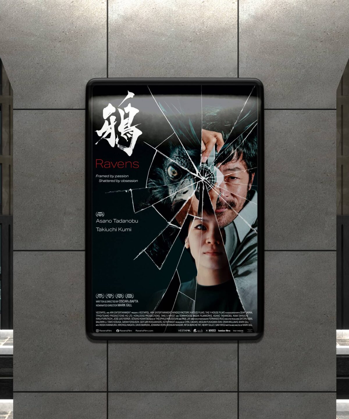
Ravens: A Story Told in Fragments
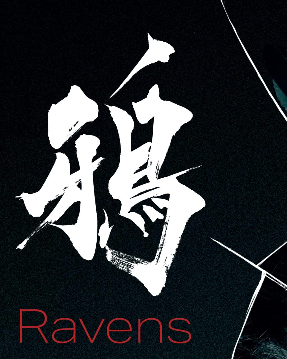
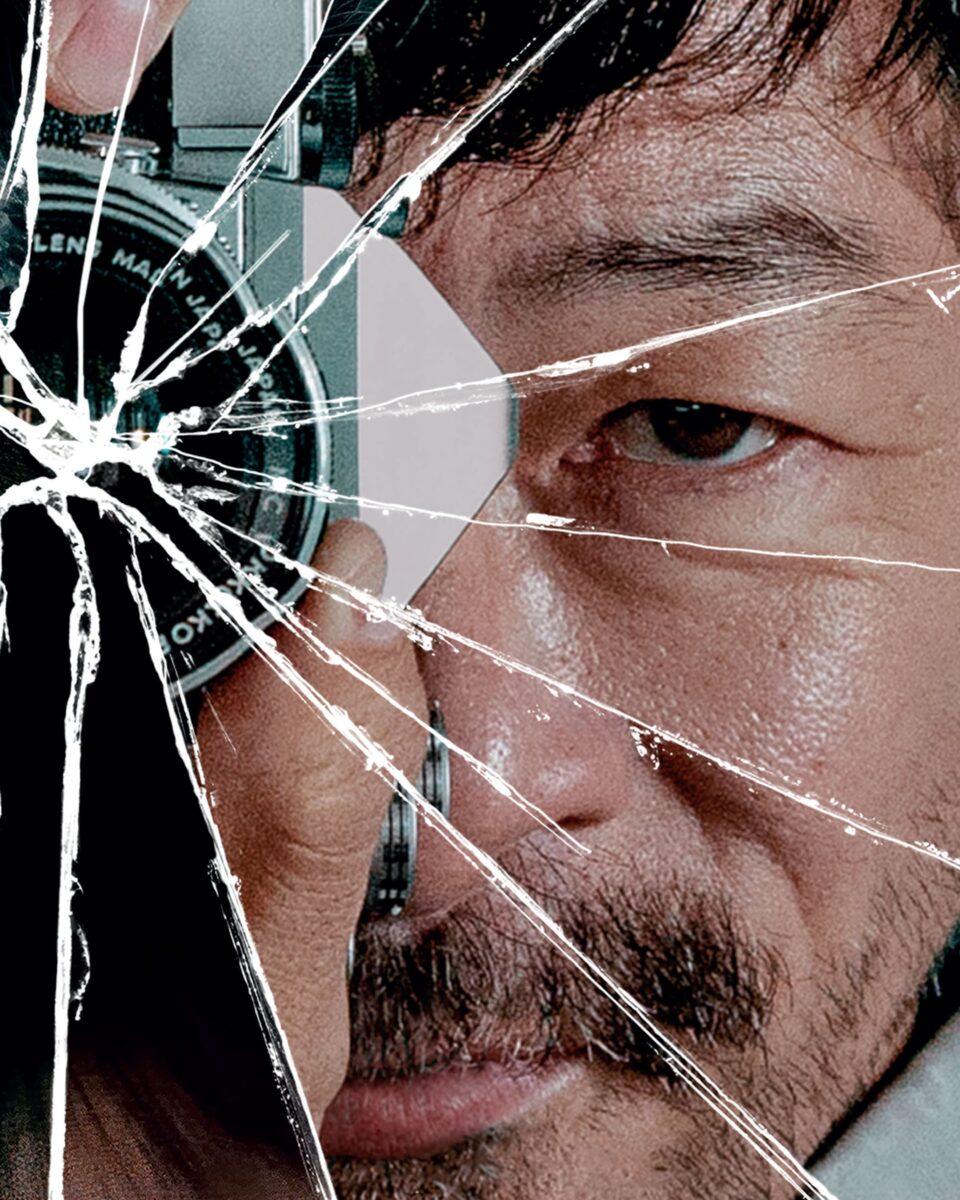
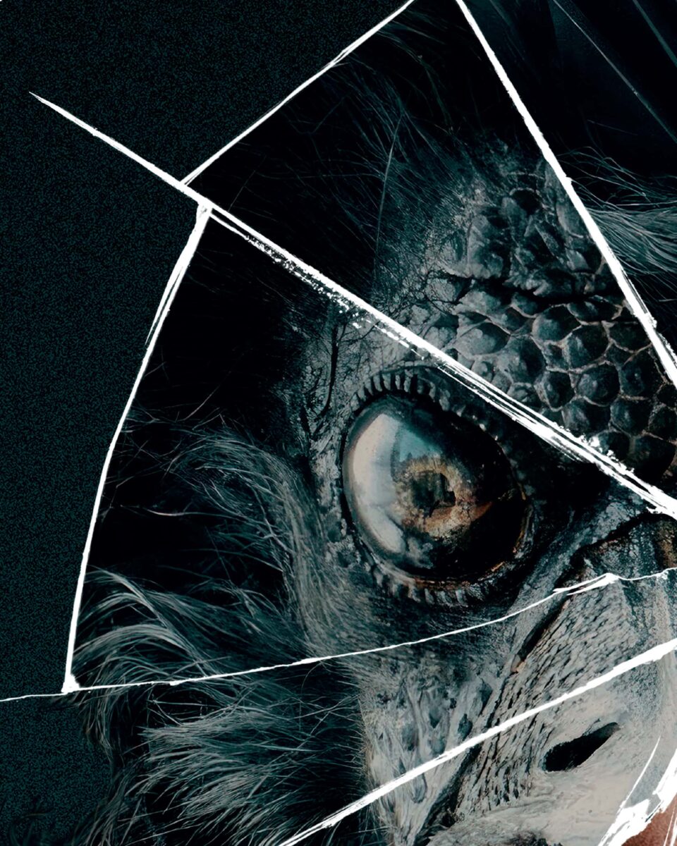
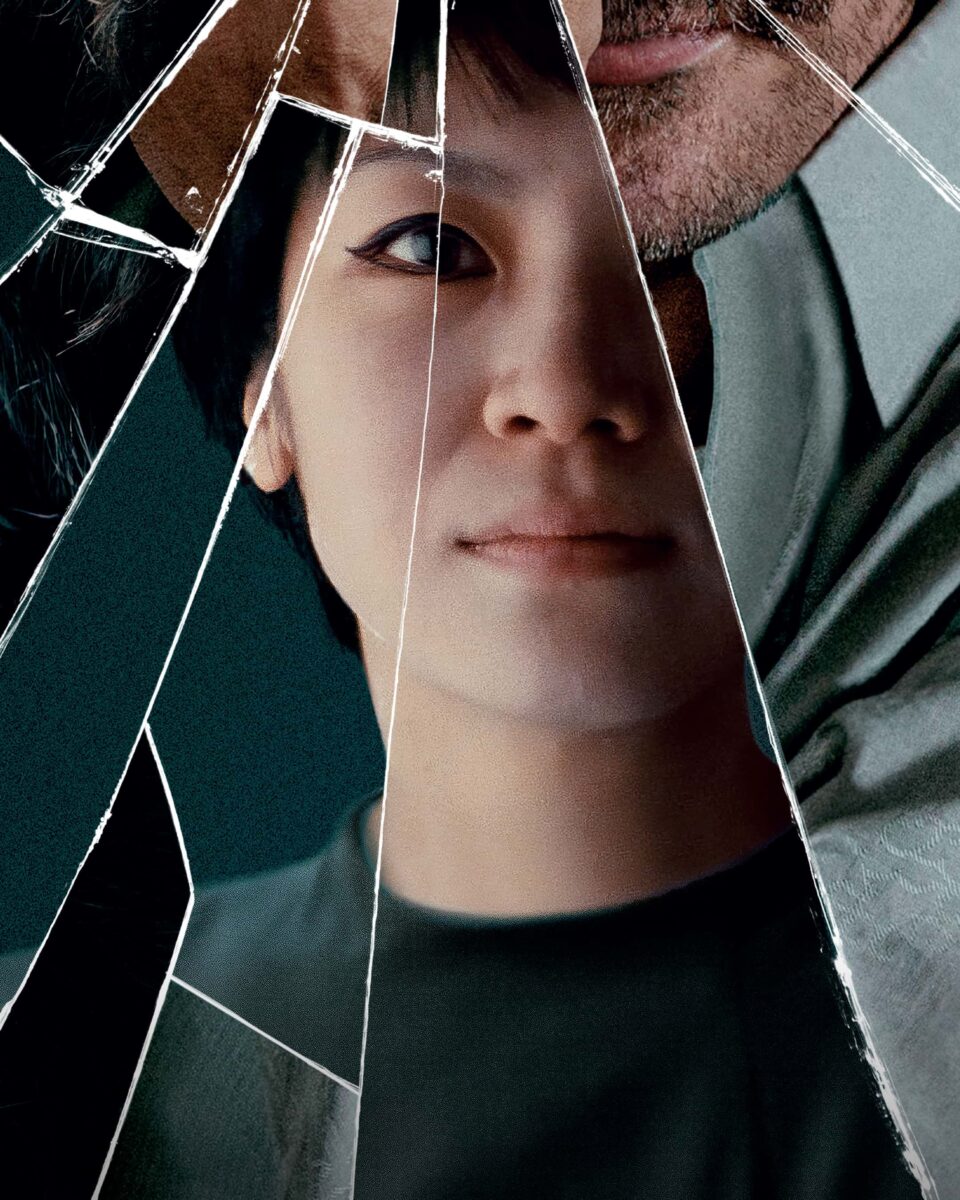
Our poster for Ravens visually distils the film’s essence into a single, striking image—shattered glass, each fractured piece reflecting a fragment of Fukase, the Raven, and his wife, Yoko. The cracks symbolise more than just physical destruction; they embody the fracture of a nation rebuilding in the wake of war, the splintering of an all-consuming love, and ultimately, the fracturing of a brilliant yet tormented mind.
The film explores love, loss, and artistic obsession, inspired by the life of Masahisa Fukase, whose haunting photographs chronicled both his devotion to Yoko and his descent into solitude. The inclusion of The Raven, the enigmatic and surreal presence within the film, adds an additional layer—blurring the line between memory, madness, and myth.
Like Fukase’s work, the Ravens poster is both stark and poetic, a visual metaphor for the themes at the heart of the story. In a post-war Japan still reeling from its past, Fukase’s personal tragedy mirrors the nation’s own reckoning. What remains is a shattered world, each fragment reflecting a love story that is as beautiful as it is devastating.
Captions for details:
- • Visual Language – The cracks guide the viewer’s eye, forcing them to piece the story together, much like Fukase does through his photography.
- • Colour & Tone – A muted, haunting palette evokes the film’s melancholic atmosphere, drawing from Fukase’s own stark, high-contrast imagery
- • Typography – Minimal, restrained, letting the image do the heavy lifting—because silence can be just as powerful as words.
- • Symbolism – Each fragment of glass reflects Fukase’s world splitting apart—his love, his identity, his sanity—mirroring the fate of a post-war Japan struggling to redefine itself.
The Ravens poster doesn’t just promote the film—it embodies it. Striking, unsettling, and deeply symbolic, it became a key visual for the film’s marketing, sparking discussion and resonating with audiences drawn to its layered storytelling.
Crafting Identity Through Poster Design
This commitment to storytelling through design is something we’ve carried across multiple projects. Each film presents a different challenge—how do you distil a complex narrative into a single image?
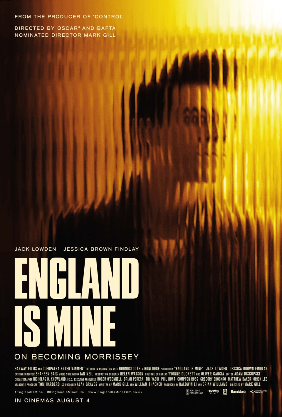
With England is Mine, we used reeded glass to reflect Morrissey’s emerging identity. The poster was built around a defining visual from the film—Morrissey (played by Jack Lowden) seen through a reeded glass door. This obscured view symbolised his transformation from Steven Patrick Morrissey into the enigmatic cultural figure he would become, reinforcing themes of identity, isolation, and artistic evolution. With its muted colour palette and moody textures evoking both the film’s introspective tone and its industrial setting—a striking, understated portrait of an artist on the cusp of becoming.
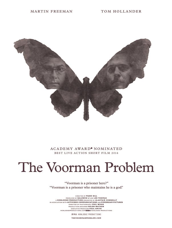
For The Voormann Problem, we took a different approach, focusing on psychological intrigue. The poster was inspired by Rorschach tests, featuring inkblot-like silhouettes that, upon closer scrutiny, revealed the profiles of the lead actors, forming the wings of a butterfly. This motif not only symbolised transformation but also invited a moment of revelation for the viewer—mirroring the film’s exploration of perception and hidden meaning.
Why It Matters
The best film posters don’t just sell tickets—they set the stage for what’s to come. They are the first moment of engagement, the first clue to the film’s world, and in some cases, the first piece of art a filmgoer will associate with a story.
In an era where marketing often prioritises flexibility over creativity, it’s more important than ever to fight for the integrity of movie poster design. Not every poster has to be a masterpiece—but it should at least mean something. It should invite curiosity, hint at a mood, and leave an impression before the first frame even rolls.
So maybe the real question is this: What if movie posters weren’t just made to sell films, but to be remembered?

